

EMBRACE YOUR COLOUR PALLETTE
How do you feel when you walk into your home? Relaxed? Calm? Excited? Or, perhaps none of the above? We focus on the feeling of your home when designing, and we want it to feel like the most perfect place you've ever been.
To do this, we look at what you are drawn to and what makes you happy and then create the perfect space for you. We consider many elements when doing this, but one of the biggest is colour. The right colour palette can make a huge difference to a space with minimal investment.
Let's get those paint brushes at the ready. Which of these is you?
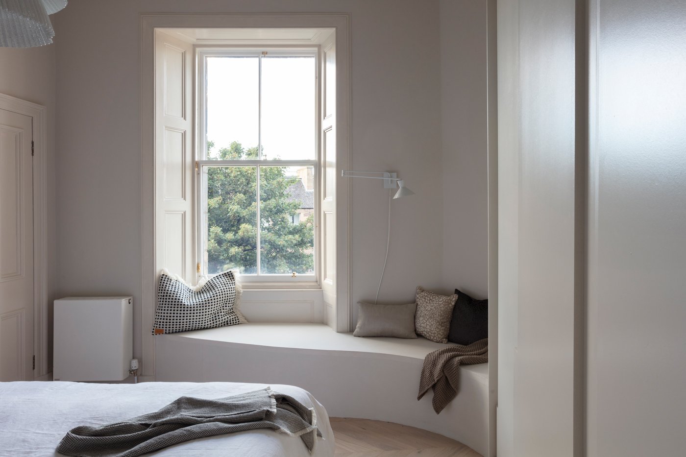
1. LIGHT, BRIGHT ROOMS IN WHITE
Do you crave light and bright spaces? Do you need your room to be every shade of white for you to feel at home? In that case let's explore the enormous world of white, because we're sure brilliant white trade paint isn't quite what you have in mind.
There are undertones to every shade of paint, and when we search for the perfect pairing it is the undertone that dictates where we head. A south facing room with daylight constantly streaming in can handle something with a more blue undertone. Place blue undertones in a north facing room at your peril, soon you'll be evoking hospital waiting room vibes!
To develop an idea of our clients’ undertone preference, we will often explore the rooms they are drawn to and look at the pairings. Are there elements of green in there, pink vases or flowers, or is it all cool blues? This helps us understand which way to take the undertone colour.
The world of white is nuanced and often harder to pin down than a colourful pallette. Even when we’re selecting something as simple as a white, we consider the whole picture and your style preferences to tailor the space that you need.
2. SERENE ROOMS IN BLUE
Blue is the perfect colour to evoke the calmness of the sea and the sky. It's a treacherous beauty so play carefully, it can make spaces feel cold if not handled properly.
Blue decor has seen a mass upsurge in recent years, with navy becoming the kitchen colour of choice. It's bold yet safe to play with this colour.The use of navy blue adds a dark tone without venturing to blacks so it can look fresher.
One of our all time favourite blues is a Benjamin Moore paint colour called Stonecutter, it somehow changes in every light and has such a beautiful depth that transforms a space. The best blue paint should hold several undertones from a grey blue right through the the greener tones. The most important factor is that the blue isn't flat or too solid.
We love to warm up blues of all types with stone colour neutrals. It evokes a homely feeling and keeps the room cosy. If you use white, the blue tends toward its colder side. Blue is a colour you can totally embrace. Paint the whole room and layer it with linens, woven fabrics, wools and select a warm toned wood so that the blue has its perfect pals to play with and all pulls together to achieve that Studio Dean “quiet luxury” look and feel.

3. LUSH LIVEABLE GREEN ROOMS
Now we're talking. As much as I love colour in general, if I was asked in court which was my favourite I may just have to admit to this one!
Muddy, olive, pale, fresh, dark, light...anything goes for me when it comes to green. As a species we are drawn to nature, it evokes calm in us, settles our souls, and that feeling is priceless. The use of green in a home can immediately have the same effect as it does outside. A favourite for Studio Dean is to use such a dark green it is almost black. The drama it adds is wonderful whilst remaining utterly calm and relaxing.
If using green on your walls is a little too scary, add it with plants. Nothing brightens a space quite as well as a pop of green in a dark corner. We're big fans of adding plants to bring spaces to life, hanging planters with trailing leaves, teeny cactuses just adding interest or huge statement plants - we love them all!

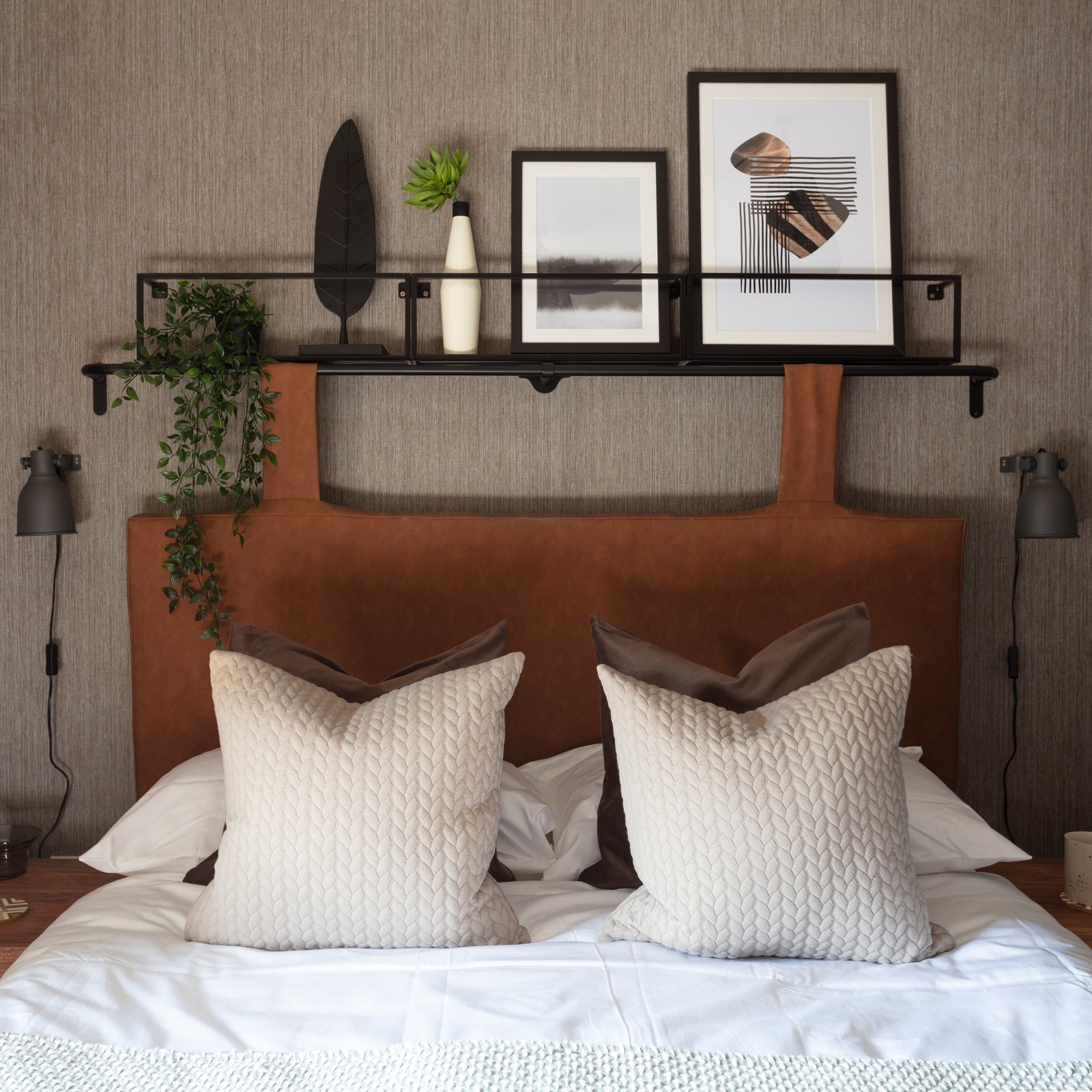
4. WARM, NEUTRAL COLOUR SCHEME
Our love of the warm neutral is evident throughout our portfolio. There is nothing quite like the cocooning feeling of the perfect neutral.
Neutral may look simple, but at Studio Dean it is often the colour palette we obsess over the most, working to make sure one solid neutral works with every single colour in the scheme. The selection of this central colour can keep us analysing for days at different light levels to make sure it is 'the one'. We take colour seriously!
As when selecting whites, the undertones here really are the key. It will talk to the other colours used in the rooms and if you mis-match, they just don't sit well together. Once we have a scheme together and those undertones become very clear, we then run through every paint sample we have to find the perfect match. There are regularly switch outs, sometimes the neutral will make one colour in a scheme read differently so it involves us switching the green / blue / pink in order to ensure the whole home is cohesive.
Thinking you may consider a change to your scheme? A couple of tips from us:
Try to look at all of the colours for your home together and create one beautifully cohesive pallette, not a series of rooms that will feel disjointed.
Check the colours in different lights, at different times through the day and think about how it makes you feel. Sometimes the room you thought should be blue just doesn't work with the cooler tones. Feel free to change your mind and pop a warmer neutral in there instead.
Our colour work with clients all happens at our style meeting before we embark on their design. We look at which colours speak to them and then select the perfect spot in their homes for those colours to have the most impact.
Our library in the studio has thousands of colours so if you find yourself in need of professional help get in touch, we'll be sure to consider all the options and find your ‘happy colours’.
Get more lightbulb design moments sent to your inbox monthly by signing up for our newsletter.
Until next time,
